I am a Reservoir Engineer by background, but I have a deep, personal passion for raw data and in particular for
using it to create visualizations that convey a message in a concise, powerful and potentially beautiful way.
In that sense, the oil industry is the perfect workplace: tons of data and simulation results sitting around
waiting for someone to come by and transform numbers into images. You know, the usual "a picture is worth a
thousand words" and blah blah blah.
I will not mention the already overhyped (and very often misused) concept of "Big Data" anywhere in this post:
I've seen way too often people labelling the analysis of a few thousands files or a few gigabytes worth of
numbers "Big Data". It is not. The "Big Data" concept can be applied to data that is too big to load and
work with entirely in RAM, too big to store on a single computer’s hard drive and potentially
requiring computer clusters for parallel operations.
I have seen data scare people, but I have also seen data turned into beautiful works of art: I will not
classify the visualizations I present in this post as "beautiful", I will leave that judgement to your own
personal taste... but I had a lot of fun in creating them.
Note: This web page is designed to work on (large enough) PC screens, so some interactive visualizations may look funny on mobile devices.
A Closer Look at Maersk's Social Activities: Introduction
Visualizations of Maersk Group's Social Activities
Early in September 2016 I became curious about the Maersk Group activities on major
social platforms (Twitter, Google+, LinkedIn, Facebook), and specifically about the distribution of Tweets/posts
for each business unit in Maersk (Maersk Line, Maersk Oil, APM Terminals, etc...) over time, based on
geographical location of the poster, which words were more frequent, if there were spikes in social activities
on any platform and so on.
All the data is in the public domain, as Tweets and posts are public by default: the only hassle is collecting
them across multiple social platforms over time and organize them in such a way that the resulting data can
be visualized - and potentially some insight can be derived. For collecting data and post-process it I used
the very popular programming language Python, while for interactive visualizations
I decided to settle for the powerful, JavaScript-based D3.js library.
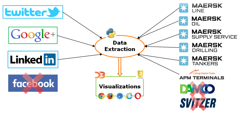
For the Maersk Group social activities, the data presented here spans the period from the 1st of January 2016
to the 24th of September 2016. The high level workflow I used for this little project is
summarized in the figure below:
High level workflow for data processing and visualization
I had to give up on analyzing Facebook posts as Facebook does not currently provide an API to mass-retrieve public
posts on a specific subject using code; moreover, I had to exclude two Maersk Group divisions from the analysis (and specifically
Damco and Svitzer), as there are way too many "Peter Damco" and "Jennifer Svitzer" around for me to be able to
filter out only the posts related to Maersk Group business units.
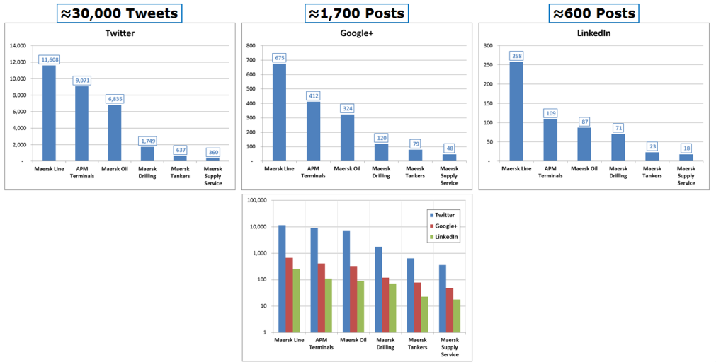
After the first quick look at the data, I could conclude that during the first 9 months in 2016 there have
been a substantial amount of Tweets/posts mentioning one or more Maersk Group divisions: most of them were not
generated by the official Twitter/Google+/LinkedIn accounts of Maersk Group's business units but by other
posters mentioning them in their Tweets/posts. A very high level summary of the number of Tweets/posts that
my scripts have processed is presented in the figure below:
Summary of Tweets/posts during 2016, per business unit and social platform
Now, enough chatting. Let's see if we can dive into the various interactive visualizations that I put together
and maybe analyze a few of the discoveries I have made - I am sure there are other trends/findings that I have
simply overlooked or missed, I welcome everyone to try and draw their own conclusions by looking at and playing
with the visualizations.
A Closer Look at Maersk's Social Activities: Streamgraphs
Visualizations of Maersk Group's Social Activities
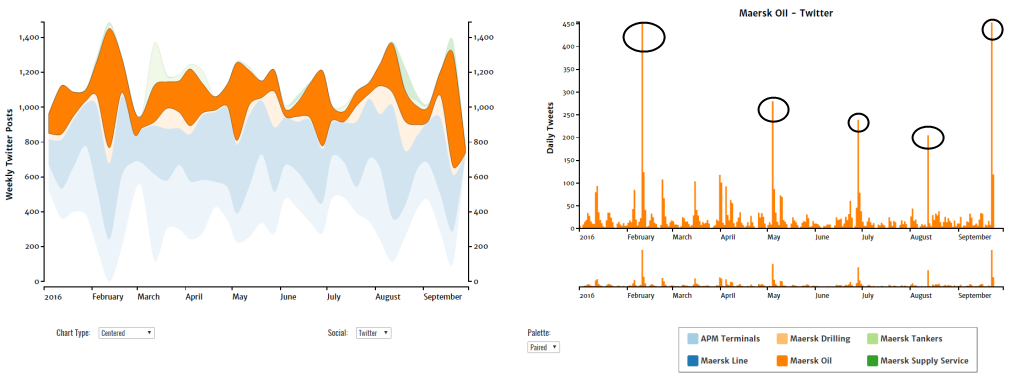
Data for a single social network is shown for all Maersk divisions as a streamgraph on the left graph,
and specifically the number of Tweets/posts per week over time.
Each stream represent the variation of the number of Tweets/posts over time, and this graphical
representation makes the comparison between divisions easier on the eye.
This graphics is interactive in many different ways:
Hovering with the mouse on a specific stream (series) will pop up a tooltip with some information about
the series and that particular time of the year.
The "Chart Type" selector allows you to change the chart type, and in particular to transform the
streamgraph into a normal stacked area chart, or a percentage area chart.
You can change the social platform for which the data is displayed using the "Social" selector; currently
Twitter, Google+ and LinkedIn data is available.
Clicking on any stream will generate a secondary graph on the right, showing more detailed information
about Tweets/posts on a daily basis for the selected stream.
The graph on the right is composed by a main figure and secondary, smaller plot that allows to zoom/pan
across a specific time span - just click-select an area in the bottom graph to zoom in into a specific
time period.
Clicking on the blank areas of the main chart will restore the original plots.
The last selector, termed "Palette", will simply switch to a different color scheme for the plots.
Chart Type:
Social:
Palette:
To try and get out some information from these graph, I have clicked on the "Maersk Oil" stream
and I went to look at the more detailed daily-based Tweets. The reason why I have chosen Maersk Oil is because
it is the company I work for, and somehow I do expect to see some high-level social activity at very specific points
in time. If you do the same as I did, you should get something similar to what I have in the image below (without
the black circles, I have added them myself):
Daily Tweets for the Maersk Oil stream
I can easily see five spikes in activity: I could tell you what specific events they represent, but I will not ruin
the fun as the next visualizations will allow you to spot and identify these spikes - even to read targeted Tweets/posts
associated to those events.
The streamgraph visualisation is a variation of a Stacked Area Graph, which instead of plotting values against
a fixed, straight axis, has values displaced around a varying central baseline. Streamgraphs display the
changes in data over time of different categories through the use of flowing, organic shapes that somewhat
resemble a river-like stream. This makes streamgraphs aesthetically pleasing and more engaging to look at.
In a streamgraph, the size of each individual stream shape is proportional to the values in each category.
The axis that a streamgraph flows parallel to, is used for the time scale. Colour can be used to either
distinguish each category or to visualise each category's additional quantitative values through varying the colour shade.
Streamgraphs are ideal for displaying high-volume datasets, in-order to discover trends and patterns over time
across a wide range of categories. For example, seasonal peaks and troughs in the stream shape can suggest a
periodic pattern. A streamgraph could also be used to visualise the volatility for a large group of assets over
a certain period of time.
A Closer Look at Maersk's Social Activities: Calendar Heatmap
Visualizations of Maersk Group's Social Activities
Data for Twitter and Google+ is shown for a single Maersk division as a calendar heatmap,
and specifically the number of Tweets/posts per day. In this visualization, each square (day)
is coloured based on the number of Tweets and Google+ posts sent on that day – the darker the colour,
the higher the frequency of Tweets/Google+ posts.
The interactivity in this visualization is exemplified as follows:
You can hover with the mouse on a specific day to check the number of Tweets/posts.
By clicking on any of the squares (days) in the calendar heatmap, another graph will appear
(termed an "events drop" plot), which represents the number of Tweets/Google+ posts for that day.
This new chart can be zoomed in with the mouse wheel down to the hours/minutes time interval, and
hovering on any specific "drop" (a point) with the mouse will show the actual Tweet or Google+ post.
In order to see the individual drops you may need to zoom in during periods of high-density events,
where the drops merge into bigger blurs.
Tweets and Google+ posts can be shown for each of the Maersk Group business units by using the "Division" selector
at the bottom of the graph.
Division:
As I was mentioning in the previous section, what happens if we select the 10th of February on the Twitter calendar heatmap? That day
marks the announcement that, unfortunately, the Maersk Group (and Maersk Oil in particular) did not have
shining full-year financial results. How about the 28th of June on the Twitter calendar heatmap? That day was a personal blow to me
as well, as the Al-Shaheen field license was not renewed to Maersk Oil but went to Total - five years of my
most exciting Reservoir Engineering and visualization work on that field! I am sure there were plenty of people
feeling just like me that day.
I will let you discover what important events are represented in the remaining three spikes in social activity.
A calendar chart is a visualization used to show activity over the course of a long span of time,
such as months or years. They're best used when you want to illustrate how some quantity varies
depending on the day of the week, or how it trends over time.
A calendar heatmap is a heatmap-like visualization where the values are visualized as colored cells per day. Days are arranged
into columns by week, then grouped by month and years to form a heatmap in the layout of a calendar.
A Closer Look at Maersk's Social Activities: World Tour
Visualizations of Maersk Group's Social Activities
In the World Tour visualization, the map of the earth is shown in two different projections, one graph on the left
and one on the right.
In the chart on the left, data for Twitter is shown for all Maersk division as a world heatmap, based on the total
number of Tweets generated in each specific country. Only a minor percentage of the overall number of Tweets has
the geo-location service activated and publicly visible, so this visualization only shows a small fraction of the total Tweets.
Countries with darker colours have the highest count of Tweets for all Maersk divisions.
In the chart on the right you can see the world map in orthographic projection.
This graphics is interactive in many different ways:
Hovering with the mouse on any country will create a pointer in the color bar below showing the actual number
of Tweets coming from there.
The map can be zoomed using the mouse wheel and panned by dragging the map with the left mouse button.
Clicking on the "Show pins" check box will show a single pin per location, coloured accordingly to the
Maersk division mentioned in that Tweet.
Hovering with the mouse on the pin will show you the actual Tweet.
By default, the resolution of world map is set to "Low": you can change it to a higher resolution using
the "Chart Resolution" selector, but please bear in mind that it will take slightly longer to load a higher-resolution
version of the world map.
As for the chart on the right: clicking on the "Animate" button will make the world spin from the country
with the highest number of Tweets to the one with the lowest. You can stop the animation and return to the
map's original state by clicking the "Stop" button.
B
Chart Resolution:
There is unfortunately little data with proper and public geo-location tag activated and visible,
so it is not that easy to draw general conclusions: the fact that Qatar is the top country in terms of Tweets
might tell us that many messages that came through Twitter were related to Maersk Oil, although I have no hard
evidence for this claim.
This type of visualization is often referred to as Choropleth Map, and it is a thematic map in which areas
are shaded or patterned in proportion to the measurement of the statistical variable being displayed on the map,
such as population density or per-capita income.
A choropleth map provides an easy way to visualize how a measurement varies across a geographic area or it shows
the level of variability within a region.
A Closer Look at Maersk's Social Activities: Word Cloud
Visualizations of Maersk Group's Social Activities
In the chart on this section, the most common words (up to 600) in all the Tweets related to a specific Maersk
division are shown as a Word Cloud. In this version of the word cloud, the word size represents the
number of occurrences that specific word has in all the Tweets related to the selected Maersk division.
The colouring of the word is only a function of the word's number of characters - i.e., by selecting
Maersk Oil as a business unit, you will notice that "oil" and "low" have the same colour as they have the same
number of characters (3).
This graphics is interactive in many different ways:
You can change the business unit using the "Division" selector.
The word cloud is dynamic, and it will re-adjust itself depending on the layout type you choose and on the word
font size scaling.
The layout type can be either "rectangular" or "spiral". Changing between the two layouts may not give that much
of a difference in terms of space occupied, but you should try and see for yourself.
The word font size scaling is a much more important parameter: linear scaling will give more prominence to very
frequent words, while logarithmic scaling will result in more uniform font sizes, even for low-frequency words.
Hovering with mouse on any word will show how many occurrences of that particular word were present in all
the Tweets related to the selected Maersk division, together with the font size used to render the word on the browser.
Division:
0%
Looking at the word cloud confirms some of the obvious suspicions: selecting, for example, Maersk Oil
as the target business unit, it's no wonder that "Oil" and "Qatar" are very prominent words. Less obvious is the clear prevalence
of other tags like "Africa" and "Shell".
If I investigate Maersk Line tag cloud, I am a bit less clear of what the big tags have to do with the company: I
can understand the "shipping", or "service", or "chinese" tags, but I am a bit more confused about the "dear" and
"dirigindo" ones...
A word cloud (tag cloud, or weighted list in visual design) is a visual representation of text data,
typically used to depict keyword metadata (tags) on websites, or to visualize free form text. Tags
are usually single words, and the importance of each tag is shown with font size or color.
This format is useful for quickly perceiving the most prominent terms and for locating a term
alphabetically to determine its relative prominence. When used as website navigation aids, the terms
are sometimes hyperlinked to items associated with the tag.
A Closer Look at Maersk's Social Activities: Force Layout
Visualizations of Maersk Group's Social Activities
In the chart on this section, all the Tweets or Google+ posts that have been re-tweeted or shared
for a specific Maersk division are shown as a Force Layout graph. The horizontal axis is a categorical
axis, showing the month of the year up to September 2016. The vertical axis shows the number of
re-tweeted Tweets or shared Google+ posts for that specific month of the year. Since there are
many bubbles per month (representing all the Tweets or Google+ posts on that month), the actual number of
re-tweeted Tweets or shared Google+ posts is the center of mass of all the bubbles in that month.
The size of the bubbles is only a function of how many times a Tweet/Google+ post has been re-tweeted or
shared: the bigger the bubble, the larger is the number of times a Tweet/Google+ post has been shared
or re-tweeted.
This graphics is interactive in many different ways:
You can change the business unit using the "Division" selector.
The nodes of the graph (the bubbles) can be coloured by Sender - i.e., non-grey bubbles are related
to Tweets/Google+ posts that originated from a Maersk Business Unit, or by time of the day the Tweet/Google+
post has been sent (red for morning, blue for afternoon/evening). You can change the colouring scheme
using the "Color" selector.
Data is available for Twitter and Google+: hovering on any specific bubble with the mouse will show the actual Tweet or Google+ post.
If a particular bubble annoys you (simply because it is too big, or because it is annoying by itself) you can
double-click on it: the bubble will disappear and the graph will re-adjust itself and find a new equilibrium.
Division:
Social:
Color:
Surprise surprise, selecting Twitter as social platform, the force layout graph for Maersk Oil shows very big bubbles for the same important
events highlighted in the previous sections of this post (i.e., the loss of the license in Qatar and the full-year
financial results). Curiously enough, choosing Maersk Line as a target division shows an enormous bubble in January,
with a Tweet in Spanish mentioning something about Ro/Ro, which I assume are vessels designed to carry wheeled cargo
(please forgive my ignorance). After double-clicking on that bubble to delete it, all the other Tweets/posts come
out in all their glory, with some very interesting messages to read.
Normally, a force layout graph (or force-directed layout, or network graph) is a node-and-link graph.
More specifically, it’s a network graph. It's purpose is to position the nodes of a graph in two-dimensional
or three-dimensional space so that all the edges are of more or less equal length and there are as few crossing
edges as possible, by assigning forces among the set of edges and the set of nodes, based on their relative
positions, and then using these forces either to simulate the motion of the edges and nodes or to minimize their energy.
While graph drawing can be a difficult problem, force-directed algorithms, being physical simulations,
usually require no special knowledge about graph theory.
A Closer Look at Maersk's Social Activities: Conclusions
Visualizations of Maersk Group's Social Activities
I guess I haven't highlighted that many conclusions/highlights from the available data, although
I find it very interesting to play with the visualizations to try and spot patterns or unexpected Tweets/posts.
With more than 30,000 Tweets and around 2,300 posts between Google+ and LinkedIn, there is enough information
to keep someone busy for days.
I can only highlight a few points that came out of this little project and from my previous experiences in data
visualization:
There is a tremendous amount of data out there: the difficult task is always to come up with a meaningful
way to pre-process it, visualize it in a proper (and potentially beautiful) way and to extract insights from it.
For some type of data, specific visualization techniques are more appropriate than others. Think about
proportions, for example: most people may come up with a pie chart, although it is almost never the right solution unless
you have three (or less) categories to compare - or if you want to annoy other people by presenting a pie chart
with 10 different slices in it. For other types of data, no obvious visualizations are available and so
existing techniques will need to be modified or new ones invented.
It was fun and rewarding to hunt for Tweets and posts all over the internet, and even better to put
together these graphics using some imaginations for the plot type and the data to present: D3.js is a very
powerful library when it comes to interactive visualizations.
If you have an inclination for handling and visualizing data, do it: squeeze it, cut it, play with it
as it was Play-Doh: I have found quite a few times that switching perspective (i.e., the way at which I am
looking at a particular dataset) can give interesting results and new insights.
I hope you have enjoyed this post - hopefully I have not annoyed you with its length. If you have any suggestion
or comment, please feel free to reach out to me!